
See clearly.
Lead confidently.
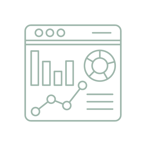
Most organizations have data. Very few have clarity. SmartMetrix helps nonprofits and faith-based organizations build the data foundation they need to lead with clarity and get real value from AI.
You shouldn’t have to guess
You have reports. You have dashboards. You have data coming from everywhere. And still… something feels off. Numbers don’t quite line up. Teams are looking at different versions of the truth.
And when it’s time to make a decision, you’re not as confident as you want to be. That’s not a data problem. It’s a clarity problem.
And now there's a new layer - AI tools that promise to help, but only work if your data is actually ready for them.
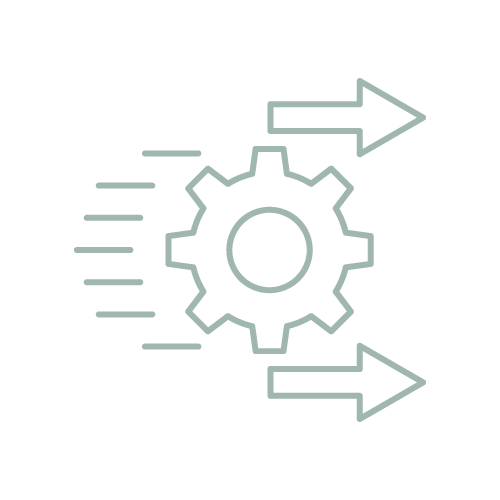
A simple path to clarity

Step 1
Clarify what matters
We identify the handful of metrics that actually drive your ministry forward including which AI use cases are actually worth pursuing for your organization.

Step 2
Align your data
We bring your data into one clear, trusted, AI-ready view your whole team can rely on.

Step 3
Equip your team to lead
We design dashboards, workflows, and AI tools that turn your data into confident decisions - without needing a data team.


We’ve been on your side of the table
Before SmartMetrix, I was part of the original team that launched the Bible App in 2007 — helping grow it to over 50 million users. I've seen firsthand what happens when a mission-driven organization gets its data right.
Since then I've led analytics inside one of the largest nonprofits in the country, and worked with 100+ churches and nonprofits to help them move from scattered data to clear direction.
Now I'm helping those same organizations take the next step: building the AI-ready data foundations that let leaders actually use the tools they're hearing so much about.
What this looks like in practice
No fluff. No overcomplication. Just clarity.
-

Define the metrics that actually matter (not just what’s available)
-

Create a single source of truth across your systems
-
Build clear, decision-ready dashboards
-

Add context so your team knows what they’re looking at
-
Establish rhythms that turn data into action —not just reports
What changes

Before
Data lives in too many places
Reports don’t quite match
Teams interpret things differently
Decisions feel reactive
After
One clear view of what matters
Aligned leadership conversations
Confidence in the numbers
Decisions that move things forward
Trusted by organizations across the country

You don’t need more data.
You need clarity.
If something feels off in how your team is using data, it probably is. Let’s fix that.